Ready to print your book?
Upload your files, choose your options, and start selling — all in one place.
Start Your Bookstore →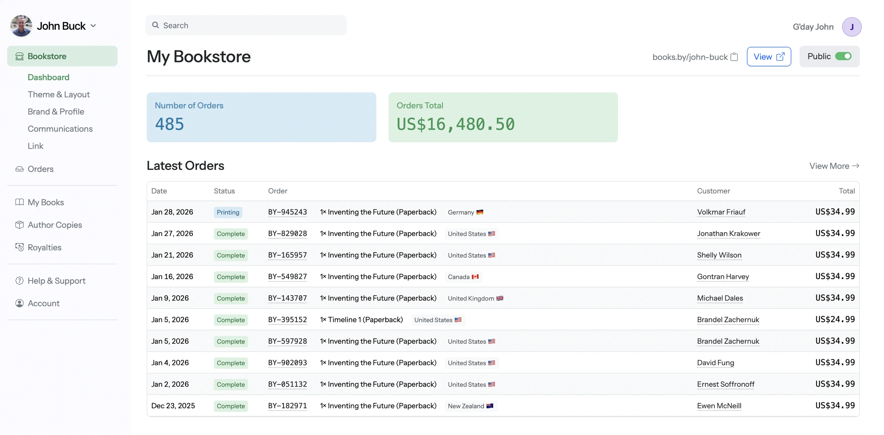
Choosing the right ink and paper combination can make or break your book's look and feel. Here's everything you need to know.
Each option is optimized for different types of content. Choose based on what's inside your book.
Crisp, clean text on white or cream paper. The classic choice for text-heavy books. Lowest print cost, which means more profit per sale.
Black ink only — no grayscale images (they'll print, but quality is basic). Perfect when your book is primarily words.
Full CMYK color printing at an affordable price point. Great for books that mix text with color images, diagrams, charts, or illustrations.
Colors are vibrant and accurate — more than sufficient for most illustrated books. The sweet spot between quality and cost.
The highest quality color reproduction available. Richer saturation, deeper blacks, and more accurate color matching on heavier premium paper.
Noticeably superior print quality — the kind you'd expect from a professional art book or gallery catalog. Higher print cost, but the results speak for themselves.
Paper weight and finish affect how your book looks, feels, and reads. Here's what's available.
Bright white, uncoated paper. Clean and modern feel with good contrast for text. Slightly thinner, keeping page counts and costs manageable for longer books.
The bright white base makes text pop with high contrast. Preferred by readers who find cream paper too "vintage."
Warm, off-white cream paper. The traditional choice for fiction and literary books. Easier on the eyes for long reading sessions — less glare than bright white.
Gives your book a classic, "real book" feel. Most traditionally published novels use cream paper. Readers associate it with quality fiction.
White paper optimized for color printing. The coating helps ink sit on the surface for brighter, more accurate colors than uncoated paper.
Great balance of color quality and cost. Colors are vivid without the premium price tag. Most illustrated books use this paper.
Heavier, thicker premium paper with a smooth coated finish. The extra weight gives pages a luxurious feel — less show-through, more substance in your hands.
The heavier stock paired with premium color ink produces gallery-quality results. Colors are richer, blacks are deeper, and the overall impression is noticeably upscale.
Not sure which combination is right? Here's a quick guide by genre.
Order a proof copy first. Always order a physical proof before making your book available for sale. Screen colors and printed colors are different — what looks perfect on your monitor may need adjustment on paper.
Images need 300 DPI. For color books, make sure all images are at least 300 DPI (dots per inch) at print size. Low-resolution images will look blurry or pixelated in print, even if they look fine on screen.
Use CMYK color mode. If you're designing in Photoshop or InDesign, convert your images to CMYK color mode. RGB (screen colors) don't translate perfectly to print — CMYK gives you more accurate results.
Cream paper + color don't mix. Color printing is only available on white paper. If you need color illustrations, you'll use white paper. Cream is for black & white only.
Premium Color is best for children's books and visual showcases. Children's picture books, art books, and photography books benefit most from Premium Color's superior colour reproduction and heavier paper. For higher page count colour books like cookbooks, comics, and graphic novels, Standard Color is the better choice — it offers good colour quality at significantly lower cost per page, which keeps your print costs manageable on books with 100+ pages.
Upload your files, choose your options, and start selling — all in one place.
Start Your Bookstore →